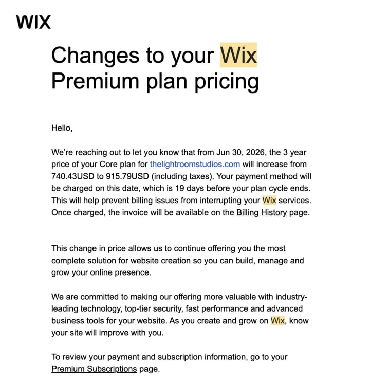
The email showed up the way these emails always do — politely, with a deadline. Our Wix plan was up for renewal, the price had quietly climbed, and the total sitting at the bottom was $915.79. It would be charged automatically on June 30th, nineteen days before the cycle even ended, “to help prevent billing issues from interrupting your services.”
We're a two-person studio in New York — we shoot photo and video for artists and galleries. Nine hundred dollars is not an abstraction at that size. It's a lighting kit. It's a flight to a shoot. It's a month of breathing room. So instead of clicking pay, we asked the question we probably should have asked years earlier: what are we actually renting here?
The honest answer was: less than we thought. This is the story of what we built instead — a faster site we own outright — and a plain-language playbook you can copy if you're holding the same invoice. No code background required. We didn't have much of one either.
What were we actually paying for?
A website builder sells you ease, and it's real ease — drag a block, pick a template, publish. For a while that's exactly what you want. The trouble is what the convenience quietly keeps. The site lives on their system, in their format, behind their monthly fee. You can edit it, but you don't really own it, and the price is theirs to raise. Ours just got raised.
There's a small irony we couldn't shake. We light other people's work for a living. We obsess over how a painting is framed, lit, and reproduced so the artist owns a clean record of it forever. And here we were renting our own frame, month after month, with no way to take it with us. The renewal notice just made it impossible to keep ignoring.
So we decided to own it. Not as a tech flex — we had no interest in becoming developers — but the same way a photographer keeps the negatives. The files should be ours.
What a studio website is actually made of
Strip away the page builder and a website is surprisingly simple: a handful of plain files in a folder, sitting on a server, pointed at by your domain name. That's the whole thing. Here's the stack we landed on and why each piece earns its place — open it if you want the parts, skip it if you just want the story.
The whole stack, plain and short
None of this is exotic. It's the ordinary plumbing of a website. It's just usually tucked behind a monthly fee, so you never have to look at it — and never get to own it.
How we built it with Claude
Here's the part that surprised us most: building the thing was a conversation. We described a page in plain English — what it's for, what it should say, how it should feel — and the AI drafted the actual code. We previewed it, reacted, asked for changes, and moved on. Describe, draft, refine, repeat.
We want to be honest about the division of labor, because the “AI built our website” headline oversells it. The AI handled the building — the markup, the styling, the tedious consistency work across pages. We handled the directing: deciding what each page needed to prove, choosing which photo carried it, and keeping the writing in our own voice instead of the smooth, weightless tone these tools drift toward if you let them. The machine is fast. It is not tasteful. That part stayed human.
The skill, it turns out, isn't coding. It's briefing — the same muscle we use on a shoot. A vague brief gets you a generic frame whether you're talking to a camera assistant or a language model. A specific one gets you something usable on the first try.
The prompts that did the work
People imagine there's one magic prompt. There isn't. It's a handful of clear ones, each doing a single job. The pattern under all of them is the same: give it a role, give it your real constraints, tell it what not to do, and demand a specific result. Here are the actual ones — open the drawer and steal them.
The 5 prompts we'd hand to anyone
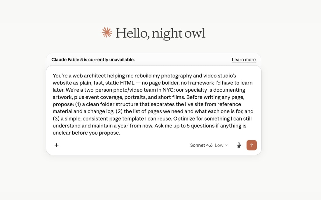
1 · The architect (run this first, once)
You're a web architect helping me rebuild my photography and video studio's website as plain, fast, static HTML — no page builder, no framework I'd have to learn later. We're a two-person photo/video team in NYC; our specialty is documenting artwork, plus event coverage, portraits, and short films. Before writing any page, propose: (1) a clean folder structure that separates the live site from reference material and a change log, (2) the list of pages we need and what each one is for, and (3) one simple, consistent page template I can reuse. Optimize for something I can still understand and maintain a year from now. Ask me up to 5 questions before you propose anything.
2 · The design system (so every page matches)
Define a small design system before we build pages: one display font, one body font, a tight color palette, spacing rules, and how images and galleries should be laid out. The work is image-heavy — photos and video are the product, so the design should get out of their way: lots of whitespace, no loud UI, fast. Output it as a single CSS file with clear comments and variables I can change in one place. Then show me the homepage hero using this system so I can react before we apply it everywhere.
3 · A gallery page (the make-or-break page for us)
Build the art documentation page. It's image-forward: a short intro, then a gallery. Requirements: every image uses a CDN URL with on-the-fly resize and compression so a thumbnail never loads a full-size original; every image has a descriptive alt attribute written for both accessibility and image search; lazy-load anything below the fold; the layout must not jump as images load. Copy voice: conversational, warm, a little dry — we're not an agency and don't talk like one. Lead with the craft, not a sales pitch. No buzzwords.
4 · Copy in our voice (the anti-agency pass)
Rewrite this page's copy in our voice: conversational, direct, warm, dry, short paragraphs, no corporate filler. Hard bans: "passionate about helping," "industry-leading," "elevate your brand," "make an impact," "resonate with your audience." We say "we," never "I" — it's a duo. Lead with what we actually do for the artist, not how great we are. Keep any sentence that already sounds like a real human; don't rewrite for sport.
5 · The findability pass (run on every page)
Add the discoverability layer to this page. Produce: (1) a title tag and meta description targeting someone searching for an art photographer in New York; (2) Open Graph and Twitter card tags with a title, description, and preview image so shared links look intentional; (3) JSON-LD schema describing us as a local professional service — a photo and video studio in New York City — including our service area and the services we offer; (4) geo meta tags for NYC. Write it so both Google and AI answer engines can state plainly who we are, what we do, and where we work. Keep it accurate — no invented awards, reviews, or numbers. Then generate a complete sitemap.xml and a robots.txt that points to it.
The part Wix was quietly handling: being found
This is the part we were most nervous about leaving behind, and the part that turned out to be the biggest upgrade. A builder handles a lot of search plumbing invisibly. Rebuild by hand and you have to put it back — but you also get to do it on purpose, which is better than having it done vaguely on your behalf.
For an image-heavy studio site, a few things matter more than people expect. Real file names and written alt text on every photo, so the work shows up in image search and the page makes sense to engines that can't actually see a picture. Structured data — a small block of code that tells Google, plainly, that we're a photo and video studio in New York, what we offer, and where we work. Open Graph tags so every link we paste into a message renders with a proper title and preview instead of a naked URL. A sitemap that hands search engines a literal map of every page. And local signals woven into the copy the way people actually search — “art documentation NYC,” “gallery opening photographer,” not just “services.”
There's a newer reason this matters, too. More people are starting their searches inside AI tools now, and those tools quote the pages they can read clearly. Structured, well-labeled pages don't just rank on Google — they're the ones an answer engine can repeat confidently. Being legible to a machine has quietly become part of being found by a human. A clean rebuild is a chance to be both.
The playbook, step by step
If you're looking at your own renewal notice, here's the whole path in order. None of it requires writing code yourself — it requires knowing what you want and saying it clearly.
The 7-step rebuild, in order
- Save what already works. Screenshot or export your current pages so you keep the copy and photos worth keeping. A rebuild is an edit, not an amnesia.
- Pick static hosting. Netlify or Cloudflare Pages — the free tier covers a studio site comfortably. This is what replaces the monthly builder fee.
- Set the folder structure before writing a single page. Live site, reference material, change log. Boring, and the thing that keeps it maintainable.
- Build page by page with AI. Describe each page, let it draft, preview it locally, refine. Don't try to generate the whole site in one shot.
- Move your media to a CDN. Photos and video served optimized, so the site stays fast no matter how much work you show.
- Add the findability layer on purpose. Titles, descriptions, schema, Open Graph, sitemap, local terms — page by page, not as an afterthought.
- Keep a short build log. One or two lines per change. Future you, picking this up after a busy month, will be grateful.
What it actually cost
The renewal we walked away from was $915.79 for the next cycle. What replaced it is a domain name — the yearly cost of a couple of coffees — sitting on free hosting. That's the whole bill. The site is faster than the one we were renting, it's entirely ours, and there's no invoice scheduled to surprise us nineteen days early.
We won't pretend the time was free; a rebuild takes real evenings of attention. But it's attention we'd spend anyway fiddling inside a builder, and at the end of it we own the result instead of leasing it. That trade was easy once we did the math.
What this has to do with your art
You might be wondering why a photo and video studio is writing about websites. Fair. Here's the honest reason. The instinct that made us rebuild our own site — wanting the files to be ours, wanting the thing built with care instead of assembled on autopilot, sweating the parts nobody sees — is the same instinct we bring to your work.
When we document an artwork, we're making a record you'll own and rely on for years: for archives, insurance, prints, applications, and the next gallery conversation. The care is the whole point. A studio that won't cut corners on its own footer is unlikely to cut them on your canvas.
If that's the kind of team you want pointed at your work, our story and how we work is a good place to start. And if you just came for the website playbook — take it, and stop paying a toll on something you could own.
FAQ
Do you need to know how to code to do this?
No. The AI writes the code. You direct it — deciding what each page is for, choosing the photos, and keeping the voice yours. You need taste and patience more than a computer science degree.
Is a static site worse for SEO than Wix or Squarespace?
Usually it's better. Static sites are faster and cleaner, and they're easy to fill with proper titles, meta descriptions, schema, and a real sitemap. Speed and clean structure help rankings rather than hurting them.
What does it cost to maintain?
For most small studios: a domain name per year plus a free hosting tier. No monthly platform fee, and no renewal invoice creeping toward a thousand dollars.
Can AI build the whole thing by itself?
No. It builds fast, but it doesn't have your taste, your voice, or your eye for which photo carries a page. The good version comes from a person directing it, reviewing it, and saying no when something feels generic.